The Rise of the Far Right
An interactive data story about Switzerland and its neighbours, built with D3 · 2025
VisualDon is a data storytelling project built with Loïc Peyramaure for the Data Visualization course at HEIG-VD. We were asked to pick a dataset, find the story in it, and design an interactive way to tell it. We chose to examine the electoral rise of the far right in Switzerland and its neighbouring countries.
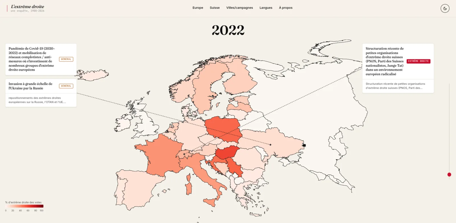
The data work came first. We consolidated electoral results from ParlGov and party positioning data from the Manifesto Project, cleaned and merged the raw CSV sources into a single dataset, and documented the methodological biases along the way. We then cross-referenced the electoral trends with qualitative socio-political events, so the curves are read in their historical context rather than in isolation.
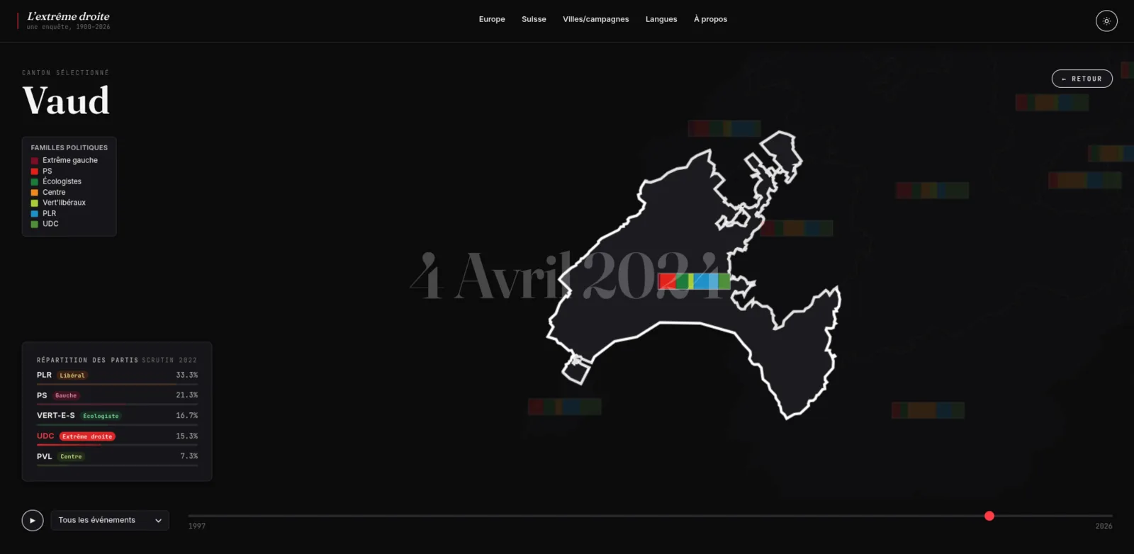
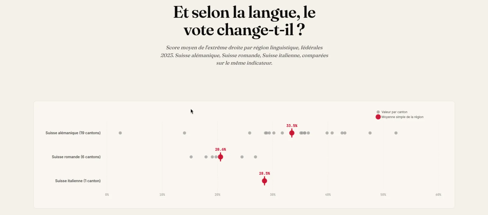
The site itself is built in JavaScript with Vite and D3, combining interactive charts with GeoJSON maps of the region to guide the reader through the story step by step.
The project was graded 6, the highest grade in the Swiss system.